Photo: MotoGP
MotoGP reveals new logo and brand identity
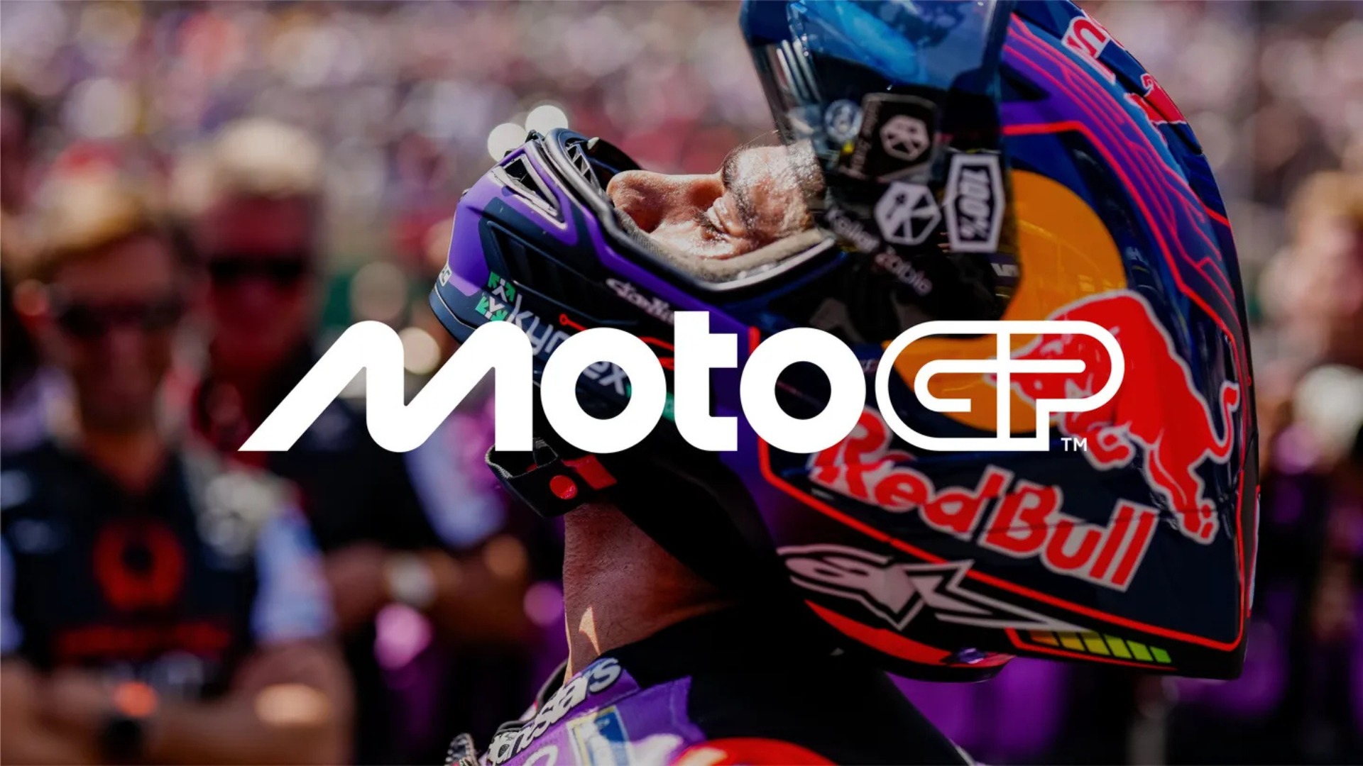
MotoGP has unveiled its new logo and refreshed brand identity for 2025 and beyond. Replacing the iconic chequered flag design, the minimalist logo was crafted by Pentagram and reflects the speed, passion, and dynamic nature of the sport.
F1 & MotoGP news to your inbox every day.
MotoGP has officially revealed a new logo as a milestone in its rebranding for 2025 and beyond.
The iconic chequered flag logo, introduced in 2002 and later updated in 2007, has been officially retired in favor of a fresh design by the series promoter. The new logo was revealed at the National Art Museum of Catalonia in Barcelona after Sunday’s race, where Jorge Martin secured the championship title. The logo was created by Pentagram, the world’s largest independent design studio.
According to MotoGP, the new logo carries symbolic elements, such as the “M,” which represents two motorcycles leaning into a turn. The “O” symbolizes wheels, while the “T” represents the rider. The “GP” at the end mimics the flow of a racetrack. This new logo is part of a broader overhaul that includes updated artwork, motion graphics, visual identity, and verbal identity.
The rebranding also extends to Moto2 and Moto3, with their logos following a similar design to MotoGP.
“We’re thrilled to unveil our new identity and invite fans around the world to experience the new MotoGP,” said Carmelo Ezpeleta, CEO of MotoGP promoter Dorna. “Collaborating with Pentagram has been an incredible journey, resulting in what we hope fans will agree is an exceptional outcome.
“A brand is much more than a logo, and MotoGP is much more than just a sport. This process has been a deep exploration of what MotoGP is and what it aspires to become. We believe this new identity captures every aspect of MotoGP—speed, passion, and everything in between. This is MotoGP.”
This brand refresh is part of Liberty Media’s acquisition of Dorna, which is expected to receive full approval by the end of the year. Many fans have noted that the new logo is very similar to the logo and introduced for Formula 1 in 2017.
MotoGP. Faster. Forward. Fearless. pic.twitter.com/bXElTEpNVU
— MotoGP™🏁 (@MotoGP) November 17, 2024
